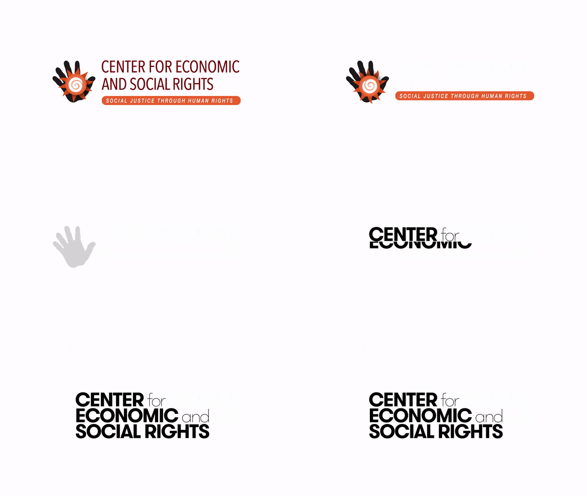
If this website seems different to you, it’s because we have a new look! After over 20 years, we’ve retired our traditional hand and sun logo for a more minimalistic one, updated our color palette, and done a few other tweaks to CESR’s image. Updating our visual identity is not just a cosmetic change: Here, we explain how it boosts our efforts to transform the economy through the power of human rights.
By: Auska Ovando, Communications Manager at CESR.
“The brain processes images 60,000 times faster than words” is an oft-cited piece of data in communications. Although the exactitude of the number has been questioned, it does point to an unquestionable truth: Images matter. Colors and forms affect how we perceive and process information, making it easier or harder to understand and remember.
One of CESR’s main goals is to ensure more people can understand economic issues through a human rights lens, and use that knowledge as a tool to demand transformation. Our 2020-2023 Strategy identified that, in order to shift the narrative about what the economy is and what it is for, we need to improve our storytelling to persuade and challenge the ideas that have cemented an unjust system.
For the past year, we’ve been working on just that. Our recently updated communications strategy reexamines the words we use to describe and share our work, and sets goals to keep making our resources more accessible to activists, organizations, and anyone interested in changing the world. After many years of accompanying our work and representing many great achievements for CESR, our logo and visual identity needed a refresh to better reflect the type of organization we have evolved into and respond to the highly visual environment in which we live. We now have a new logo, updated website, and a renewed social media look.

Making sure visual and written communications are clear, accessible, uncluttered, and jargon-free is a necessary practice for any individual or organization trying to effect systems change. To us at CESR, it is a duty. Avoiding it siloes efforts for systemic change, and makes tools for change only understandable by those already privileged. While this new visual identity entails cosmetic changes, it signals a profound effort to continue to evolve and strengthen our work to transform the economy.
